Your Website Looks Great - So Why Isn’t Anyone Using It?
You’ve spent months perfecting your website. The design is stunning. The photography is crisp. The brand colours pop perfectly on every screen. Your friends love it, your family raves about it, and even your toughest critic has grudgingly admitted it “looks professional.” So why are your analytics showing bounce rates that would make a trampoline jealous? Why are visitors spending less time on your site than they do waiting for the kettle to boil? Why does your beautiful website feel more like a museum piece than a business tool? The harsh truth is that gorgeous design means nothing if nobody can actually use your website. And unfortunately, some of the most visually appealing sites are guilty of the worst user experience sins.
The Pretty Website Paradox
Here’s what happens more often than we’d like to admit: designers (ourselves included) get so focused on creating something beautiful that we forget the fundamental purpose of a website, to help users accomplish their goals quickly and easily. It’s like designing a stunning sports car with the steering wheel in the boot. Impressive to look at, impossible to drive. After years of building websites and watching user behaviour, we’ve identified the most common UX mistakes that turn beautiful websites into digital dead ends. The good news? Once you know what to look for, they’re surprisingly easy to fix. 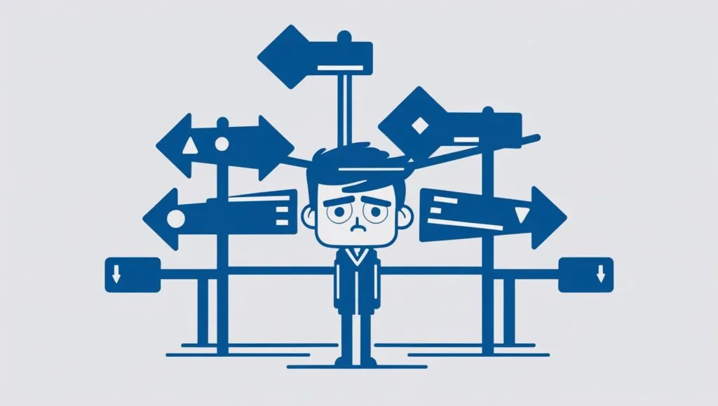
Sin #1: Navigation That Needs a PhD to Understand
The Problem: Your navigation menu reads like poetry, but users can’t find anything. We see this constantly. Creative agencies are particularly guilty of this, navigation items like “Experiences,” “Solutions,” “Insights,” and “Ventures.” What does any of that actually mean? If users have to guess where to find your services or pricing, they won’t bother. The Reality Check: Users spend most of their time on other websites. They expect navigation to work like every other site they’ve used. Fighting this convention doesn’t make you creative, it makes you frustrating. The Fix: Use clear, descriptive labels. “Services” instead of “Solutions.” “About” instead of “Our Story.” “Contact” instead of “Let’s Connect.” Save the creativity for your actual content, not your navigation. Quick Test: Show your navigation to someone who doesn’t know your business. Can they predict what they’ll find on each page? If not, it’s too clever by half. 
Sin #2: The Wall of Text Assault
The Problem: You’re treating your homepage like a novel, and users like they have all day to read it. Here’s a sobering fact: users read about 20% of the text on a webpage. Yet countless sites assault visitors with paragraph after paragraph of dense copy, expecting them to digest it all before taking action. The Reality Check: People scan, they don’t read. They’re looking for specific information that solves their immediate problem. If they can’t find it quickly, they leave. The Fix:
- Use headlines that actually tell people what you do
- Break up text with bullet points and subheadings
- Put the most important information first
- Use white space like it’s your friend, not your enemy
Pro Tip: Read your homepage copy out loud. If you run out of breath, your paragraphs are too long. 
Sin #3: The Mystery Meat Navigation
The Problem: Users have to click to discover what things do. Those elegant icon-only menus? The mysterious hover states that reveal content? The “intuitive” gestures that only make sense to the designer? They’re creating cognitive load for users who just want to get stuff done. The Reality Check: Every question mark in a user’s mind is a step closer to them leaving your site. Don’t make people think harder than they need to. The Fix: Make interactive elements obviously clickable. Use familiar patterns. If you must use icons, include labels. Test everything with real users, not just other designers. 
Sin #4: The Contact Information Hide and Seek
The Problem: You’ve buried your contact details like they’re state secrets. This might be the most baffling mistake of all. You want people to contact you, but you’ve hidden your phone number in the footer, put your email address behind a contact form, and made your physical address findable only through a site search. The Reality Check: When someone wants to contact you, they want to do it now, their way. Don’t make them jump through hoops. The Fix: Put contact information where people expect it, in the header, footer, and on a dedicated contact page. Include multiple options: phone, email, contact form, and physical address if relevant. 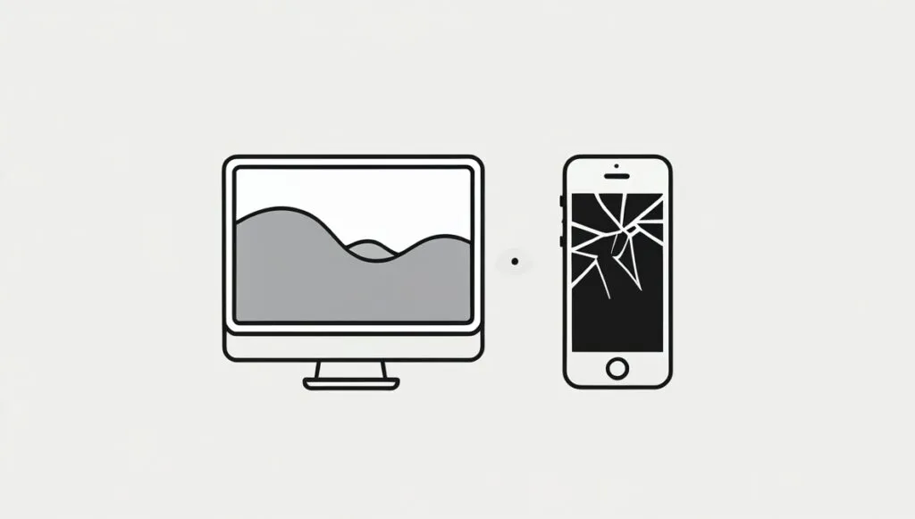
Sin #5: The Mobile Afterthought
The Problem: Your desktop site looks amazing, but the mobile version feels like a completely different (and inferior) product. With mobile traffic often exceeding 60% for many sites, treating mobile as an afterthought is like designing a shop where most customers have to crawl through the window to enter. The Reality Check: Your mobile experience IS your brand experience for most users. A poor mobile site doesn’t just lose sales, it damages your reputation. The Fix: Design mobile-first, not mobile-last. Test on real devices, not just browser tools. Pay attention to thumb-friendly touch targets, readable font sizes, and loading speeds. 
Sin #6: The Conversion Killer Loading Speed
The Problem: Your high-resolution images and fancy animations are beautiful, but they’re also making your site slower than a Sunday afternoon. Users expect pages to load in under three seconds. Every second beyond that, you lose more visitors. No matter how stunning your design is, nobody sees it if they leave before it loads. The Reality Check: Performance is a feature, not a nice-to-have. Speed affects everything from user experience to search rankings. The Fix: Optimise images religiously. Minimise animations on mobile. Use a content delivery network. Test your site speed regularly and treat slow loading times like the emergency they are. 
Sin #7: The Assumption Trap
The Problem: You assume users understand your business, your process, and your industry as well as you do. This manifests in technical jargon, unexplained processes, unclear pricing, and calls-to-action that assume too much knowledge. You’re essentially having a conversation where only you understand the language. The Reality Check: Users come to your site with their own problems, their own level of knowledge, and their own goals. Meet them where they are, not where you think they should be. The Fix: Explain things simply. Define technical terms. Make your process clear. Address common questions before they’re asked. Remember, confusion kills conversions.
The Path Forward: Making Beauty Functional
None of this means your website has to look boring. The best websites are both beautiful AND functional. They just prioritise user needs alongside aesthetic appeal. At Fractal Studio, we’ve learned that the most successful websites are the ones that make users feel smart, not confused. They guide people effortlessly toward their goals while looking fantastic doing it. The secret isn’t choosing between beauty and usability, it’s understanding that truly great design serves the user first and the ego second.
Your Next Steps
Take an honest look at your website. Better yet, watch someone else try to use it. You’ll quickly spot the gaps between how you think it works and how it actually works for real people. Remember, your website’s job isn’t to impress other designers, it’s to serve your users and grow your business. When you get that balance right, you’ll have a site that’s not just beautiful to look at, but beautiful to use.
Need help turning your beautiful website into a conversion machine? Our team specialises in creating websites that work as hard as they look good. Get in touch to discuss how we can help. Cover Photo by Yan Krukau: https://www.pexels.com/photo/photo-of-woman-showing-frustrations-on-her-face-4458420/