In today’s digital era, a strong online presence is crucial for business success. With the increasing number of mobile users, mobile first web design has emerged as a game-changer in the world of web development. In this blog post, we’ll explore why mobile first web design is essential for business success and how it can improve your online presence.
The Rise of Mobile Users
Did you know that more than half of all internet traffic comes from mobile devices? According to Statista, the number of smartphone users worldwide is projected to reach 3.8 billion in 2021, and this number is expected to grow in the coming years. This means that businesses cannot afford to ignore mobile users when it comes to web design.
What is Mobile First Web Design?
Mobile-first web design is an approach that prioritizes the design of a website for mobile devices over desktop devices. It involves creating a website with a mobile-friendly user interface that adapts to different screen sizes and resolutions. The goal is to provide a seamless user experience for mobile users, which is essential for keeping them engaged and interested in your business. Here are 4 solid reasons to use this method.:
1. Improved User Experience
Mobile-first web design focuses on creating a user-friendly experience for mobile users. By designing for mobile devices first, you can ensure that your website is easy to navigate, loads quickly, and provides all the essential information that users need. This can help to reduce bounce rates and improve user engagement, which can ultimately lead to more conversions.
2. Better Search Engine Rankings
Google has already made it clear that mobile-first indexing is here to stay. This means that Google uses the mobile version of a website to rank pages in search results, rather than the desktop version. By adopting a mobile-first approach, you can improve your search engine rankings and visibility, which can drive more organic traffic to your website.
3. Faster Page Load Times
Mobile first web design also involves optimizing your website for faster page load times on mobile devices. This is important because mobile users are often on-the-go and have limited patience for slow-loading websites. By reducing the size of images and optimizing code, you can ensure that your website loads quickly on mobile devices, which can improve user experience and reduce bounce rates.
4. Competitive Advantage
By adopting mobile first web design, you can gain a competitive advantage over businesses that have not yet optimized their websites for mobile devices. With more and more users accessing the internet from mobile devices, businesses that do not prioritize mobile-first web design risk losing out on potential customers and revenue.
Mobile first web design has become increasingly popular in recent years, and many businesses have already adopted this approach to improve their online presence. In this section, we’ll take a closer look at the top 5 websites that use mobile-first web design.
5 Major Companies that use Mobile First Web Design
1. Airbnb
Airbnb is a popular online marketplace that allows users to book unique accommodations all over the world. The company has adopted a mobile-first approach to web design, with a mobile-friendly interface that provides easy access to all the essential features of the platform. The website loads quickly on mobile devices and offers a seamless user experience, making it easy for users to book their next vacation from their smartphone.
2. Starbucks
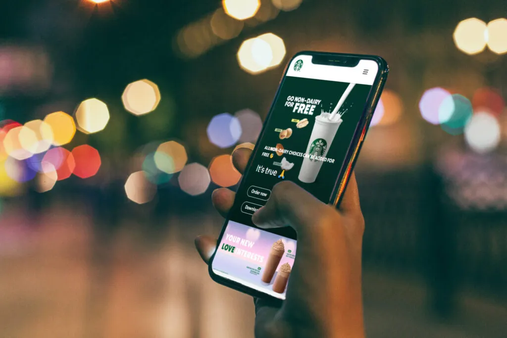
Starbucks is a well-known coffeehouse chain that has a mobile-first website design. The website is optimized for mobile devices and provides a smooth user experience, with a simple and clean interface that allows users to easily find information about products, locations, and more. Starbucks also offers a mobile app that allows customers to order and pay for their coffee directly from their smartphone.
3. Amazon
Amazon is one of the world’s largest online retailers, and the company has a mobile-first web design that makes it easy for users to shop from their smartphones. The website is optimized for mobile devices and offers a seamless user experience, with a simple and intuitive interface that allows users to easily browse and purchase products. Amazon also offers a mobile app that provides a more personalized shopping experience.
4. Uber
Uber is a popular ride-hailing service that has a mobile-first website design. The website is optimized for mobile devices and offers a smooth user experience, with a simple and intuitive interface that allows users to easily book a ride from their smartphone. Uber also offers a mobile app that provides additional features and functionality, such as tracking your ride and estimating your fare.
5. LinkedIn
LinkedIn is a professional social networking platform that has a mobile-first website design. The website is optimized for mobile devices and offers a seamless user experience, with a clean and intuitive interface that allows users to easily connect with other professionals and find job opportunities. LinkedIn also offers a mobile app that provides additional features, such as personalized job recommendations and the ability to apply for jobs directly from your smartphone.
In conclusion, mobile first web design is essential for business success in today’s digital era. With the increasing number of mobile users, businesses cannot afford to ignore the importance of mobile-friendly web design. By prioritizing mobile devices in web design, businesses can improve user experience, search engine rankings, page load times, and gain a competitive advantage. So, if you want to succeed online, mobile-first web design is the way to go!
Cover image Source